Confessions of a Menu Architect: How the Font on Your Pocket Is Getting Picked With Both Hands
Somewhere between the moment you sat down and the moment your credit card left your wallet, a decision was made for you. Not by your hunger. Not by your better judgment. Not even by the server who described the halibut as having "a really beautiful story." The decision was made by a woman named Renata, who spent eleven years studying how the curve of a lowercase 'e' can make a grown adult spend forty-seven dollars on pasta without blinking.
Renata — who asked that we not use her last name, her former employer's name, or the name of the font she still uses in her personal projects "out of habit" — is what the restaurant industry quietly calls a menu architect. What she calls herself, after two glasses of wine and a long pause, is "a financial predator with a MFA."
"I was not hired to make the menu readable," she told us, in a coffee shop she chose specifically because the menu was printed in Arial. "I was hired to make the prices disappear."
The Disappearing Dollar Sign: America's Most Successful Magic Trick
Let's start with the most egregious offense in the menu design arsenal, the one Renata calls "the oldest con in the tablecloth business": the removal of the dollar sign.
This is not a stylistic choice. It is not minimalism. It is not because the designer ran out of room. Extensive research — including a widely cited 2009 Cornell University study that the restaurant industry has been hoping you'd forget about — confirms that diners spend measurably more when prices are listed as bare numerals rather than currency symbols. The dollar sign activates what researchers call "the pain of paying." Remove the symbol, and your brain stops processing "47" as money. It becomes an abstract number. A jersey number. A highway. Not a thing you will be paying with actual dollars you earned.
 Photo: Cornell University, via cdn.britannica.com
"We tested it," Renata said flatly. "Dollar sign, no dollar sign. Same menu, same restaurant, same night. The no-dollar-sign table spent an average of twenty-two dollars more per person. We celebrated. I went home and didn't sleep."
A Field Guide to What Every Font Choice Is Actually Saying About Your Wallet
For the uninitiated, here is a working translation guide, compiled from our conversation with Renata and cross-referenced with the menus of seventeen restaurants across six American cities:
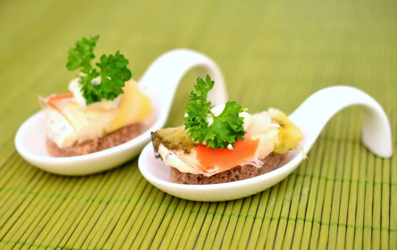
Garamond or Caslon (classic serif, slightly aged): This restaurant would like you to believe it has been here since 1887. It has been here since 2019. The font is doing the work of twenty years of fake history, and it is doing it beautifully. You will order the charcuterie because it feels ancestral. It is not ancestral. It is twenty-six dollars.
Thin sans-serif (think: a whisper in font form): This is a wellness-adjacent establishment that wants you to feel that paying $34 for a grain bowl is an act of self-care rather than a financial catastrophe. The lightness of the font suggests lightness of being. Your bank statement will not be light.
Handwritten or "hand-lettered" script: Someone wants you to believe a human being who loves you wrote this menu. No human being who loves you wrote this menu. This font costs $300 on a type foundry website and was chosen to make the $22 avocado toast feel like something your grandmother made.
All caps, wide tracking, no punctuation: This restaurant is extremely confident and would like you to be, too. You will not ask about the price of the wagyu because the font has made you feel that asking would be embarrassing. This is by design.
Comic Sans: Run. This is a trap of a different kind.
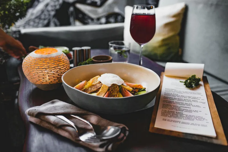
The Strategic Whitespace Industrial Complex
Beyond font choice, Renata walked us through what she considers the second most powerful tool in the menu manipulation toolkit: whitespace, deployed with the precision of a psychological operation.
"When there are only six items on a menu and they're each separated by an acre of negative space, you stop thinking about value," she explained. "You start thinking about curation. Scarcity. You think, this chef only makes six things, and I am lucky to be here choosing between them. You forget that one of them is thirty-nine dollars and it is, essentially, a chicken."
The sparse menu, she argues, is the fine dining industry's most successful rebrand. What reads as restraint is actually a volume-control mechanism for your financial anxiety. A menu with forty items forces comparison. A menu with six items forces surrender.
"I once designed a menu with four items," Renata said. "Four. The cheapest was thirty-one dollars. We had a six-month waitlist. I used a 9-point Didot and a lot of cream-colored paper. People cried about how beautiful it was. I think about that a lot."
The Price Anchor: The Most Expensive Item You Were Never Supposed to Order
Here's one Renata delivered with the energy of someone who has been waiting to confess it: the decoy entrée.
Almost every menu above a certain price point contains one item that is priced so aggressively it exists not to be ordered but to make everything else feel reasonable. A $110 dry-aged ribewell for two. A whole roasted fish at $95. A tasting menu add-on that costs more than your car insurance.
"Nobody orders it," Renata confirmed. "It is not there to be ordered. It is there so that when you see the $54 pasta next to it, your brain says 'well, that's practically a bargain.' The ribewell is a psychological service. It is the most expensive free thing on the menu."
She paused, then added: "I am very good at my job. I wish I were not."
What You Can Actually Do About This (Not Much, But Still)
Renata's advice for the financially self-preserving diner is, predictably, grim. Cover the menu with your hand and ask your server the price of anything before you consider it. Treat the removal of dollar signs as the red flag it is. Be suspicious of any font that makes you feel nostalgic for a place you've never been.
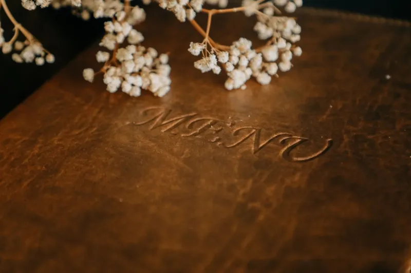
Most importantly: if the menu is printed on something heavier than 100-pound cardstock, or arrives in a leather sleeve, or is, God help you, etched onto a piece of reclaimed wood — add thirty percent to whatever number you had in your head before you walked in.
"The menu is not a document," Renata said, standing to leave. "It is a negotiation. And they hired someone to make sure you lose."
She left a cash tip. Exact change.
The Food Woke Report reached out to the restaurant industry's leading menu design association for comment. They responded with a PDF set in 8-point Garamond with no dollar signs.